Here's a collection of plots showing the measured sensitivities for a variety of climate variables to changes in other variables. Two of those variables are the planets post albedo input power (PI) and the power output or the planet (PO) which in the steady state are equal. Instantaneously, PI is not equal to PO because it takes time for a change to warm or cool the planet until PO is again equal to PI. The instantaneous difference, PO - PI, is the flux in and out of the Earth's energy storage system (FX) or the sensible heat. PI, PO and FX are the most directly captured variables from the sensors of weather satellites and conform to the equation, PI = PO + FX, where FX = dE/dt and E is the solar energy stored by the planet.
Other directly measured and easily derived variables are the power emitted by the surface (SE), power emitted by the cloud tops (CE), the surface reflectivity (SR), the cloud top reflectivity (CR), the albedo (AB), the incident solar power (IR), surface temperature (ST), cloud top temperatures (CT), the surface gain (GS = SE/PI), the system gain (GA = SE/IR), the amount of ice (IA), the fraction of the surface covered by clouds (CA) and the atmospheric water content (WC). The raw data for each of these plotted variables came from the ISCCP DX data set which has a pixel resolution of about 30 meter and near full surface coverage spanning nearly 3 decades of 3 hour samples.
The sensitivities for all relevant variables are measured and plotted with respect to IR, PI, PO, SE and CE. Each small colored dot represent one month of data for each 2.5 degree slice of latitude. Each month of data is the average of 240 whole Earth images, where each image is a moasiac comprised of from 5-8 independent satellite images from a combination of geosynchronous and polar orbiters, where each pixel of an image that is not covered by a geosynchronous satellite is captured at least twice per day by one satellite and usually 4 times per day by 2 satellites. Each of the tiny dots represents the average of many thousands of individual image pixels.
The large green and blue dots essentially show the transfer functions for each pair of variables and represents the average of all data across all samples for each 2.5 degree slice of latitude. The green dots represent the transfer function for the Northern hemisphere and the blue dots are the transfer function for the Southern hemisphere. Note that the existence of an apparent transfer function does not imply causality, that is, which variable depends on the other, or if any dependency exists at all.
Aggregating samples across 2.5 degree slices of latitude sets the predominate difference between slices to the average post albedo solar power per unit area, whose instantaneous change is the definition of forcing, per the IPCC. There are other differences including the ratio of land to water and the net flux passing between neighboring slices. The first will add variability making some slices exhibit above average response and some below and is most apparent at the S pole and its surrounding ocean. The second will tend to distort the response at the polar and equatorial slices where the flux between slices is a large negative in the tropics and a large positive at the poles, but will have little effect at the mid latitudes, where the slice to slice flux mostly cancels when integrated over a whole number of years.
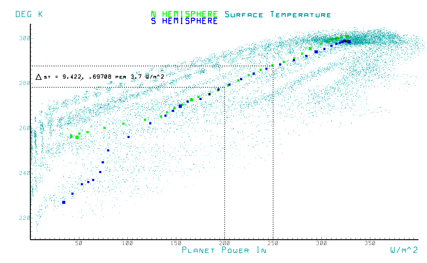
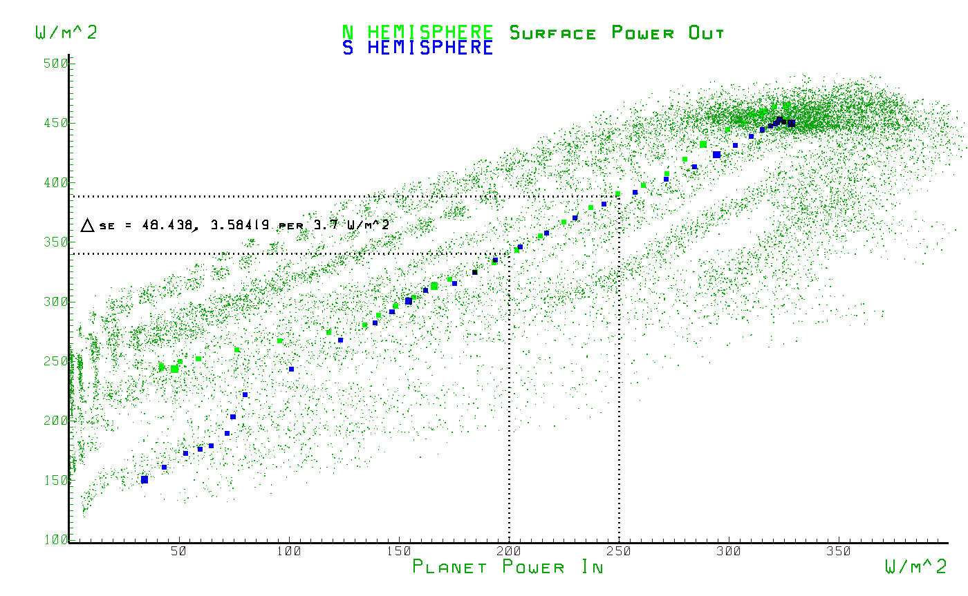
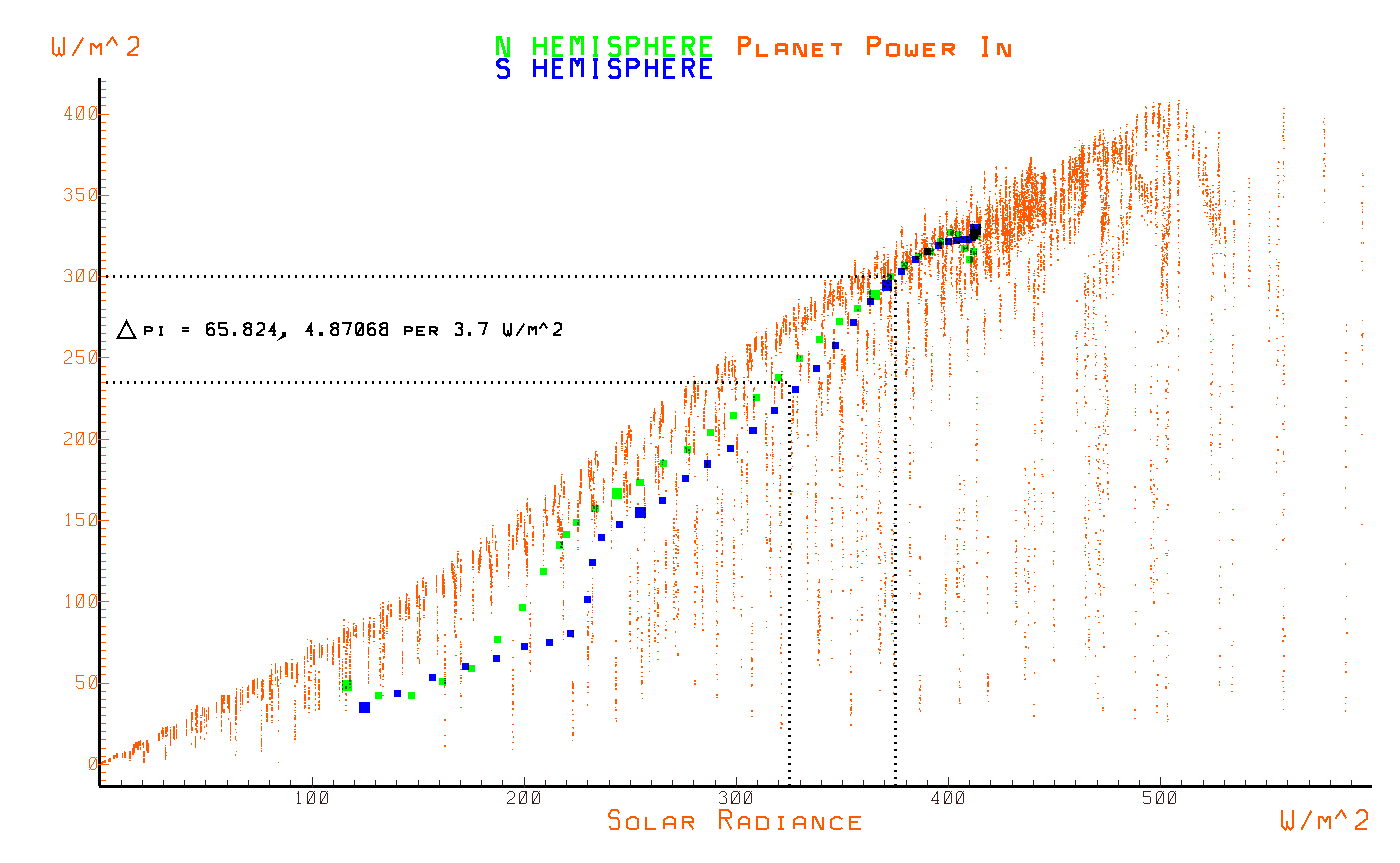
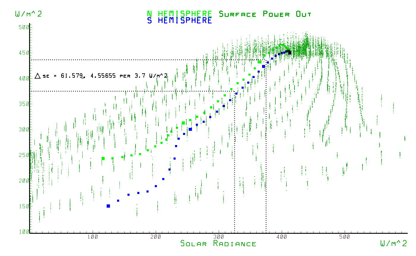
The sensitivities are calculated from a measured change in Y to a 50 W/m^2 change in X and then normalized to a sensitivity per 3.7 W/m^2 of forcing. Note that the measured sensitivity of the surface temperature to forcing is about 0.7C per 3.7 W/m^2 which is 4 times less on an emitted power basis than the 3C per 3.7 W/m^2 claimed by the IPCC.
sensitivities to solar power input (IR)
sensitivity to/from IPCC forcing (PI)
sensitivities to/from planet power output (PO)
sensitivities to/from surface power output (SE)
sensitivities to/from cloud power output (CE)
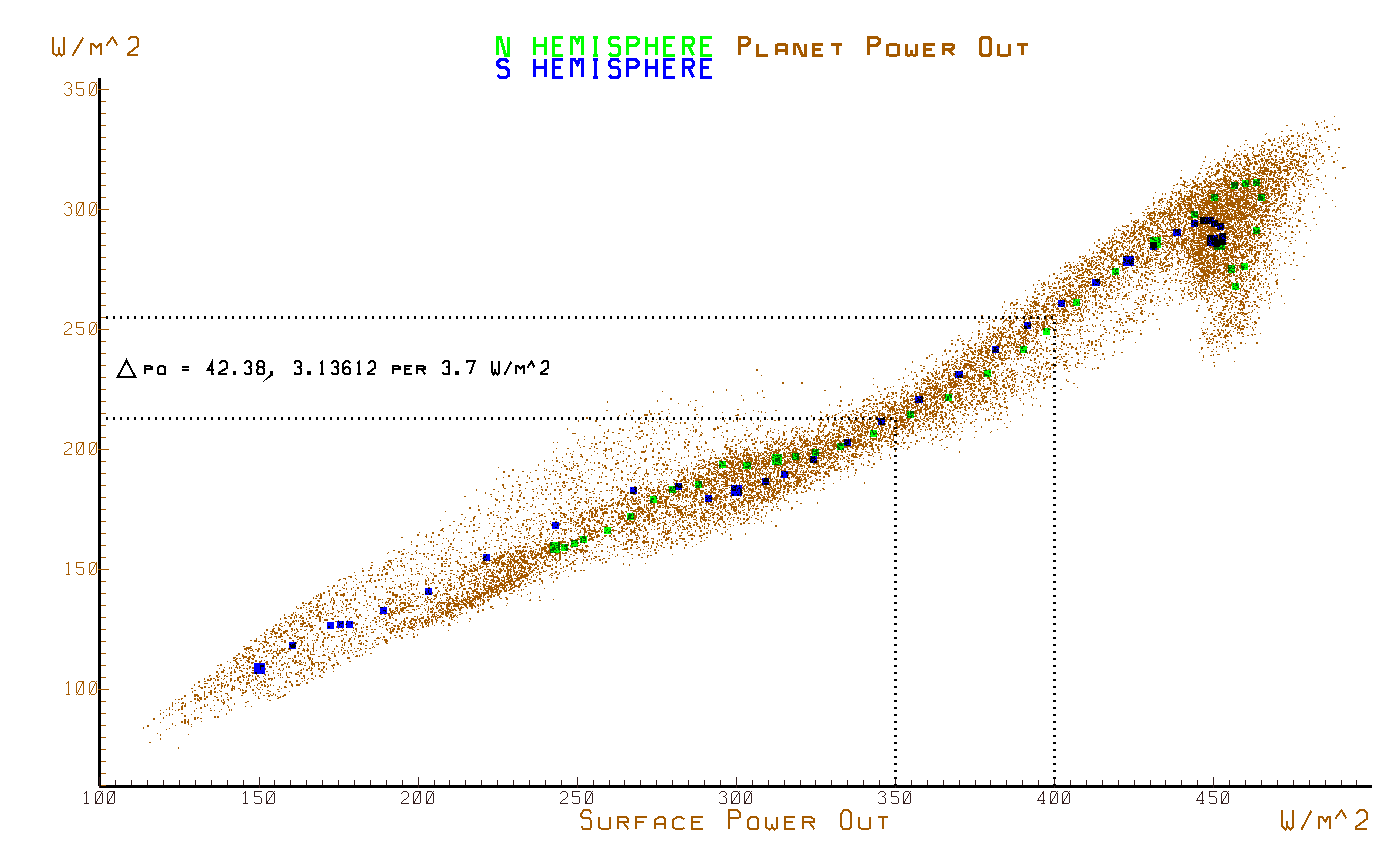
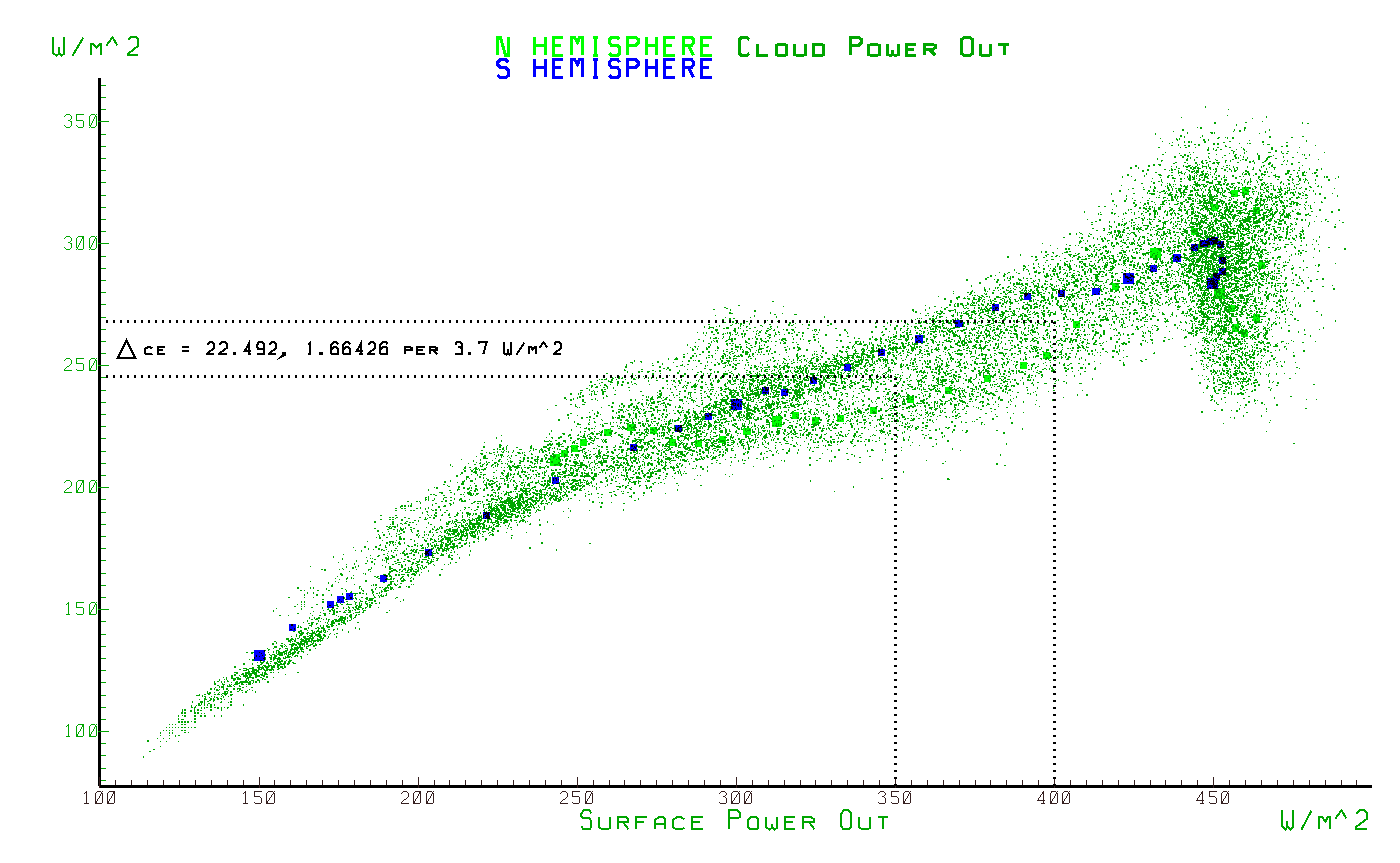
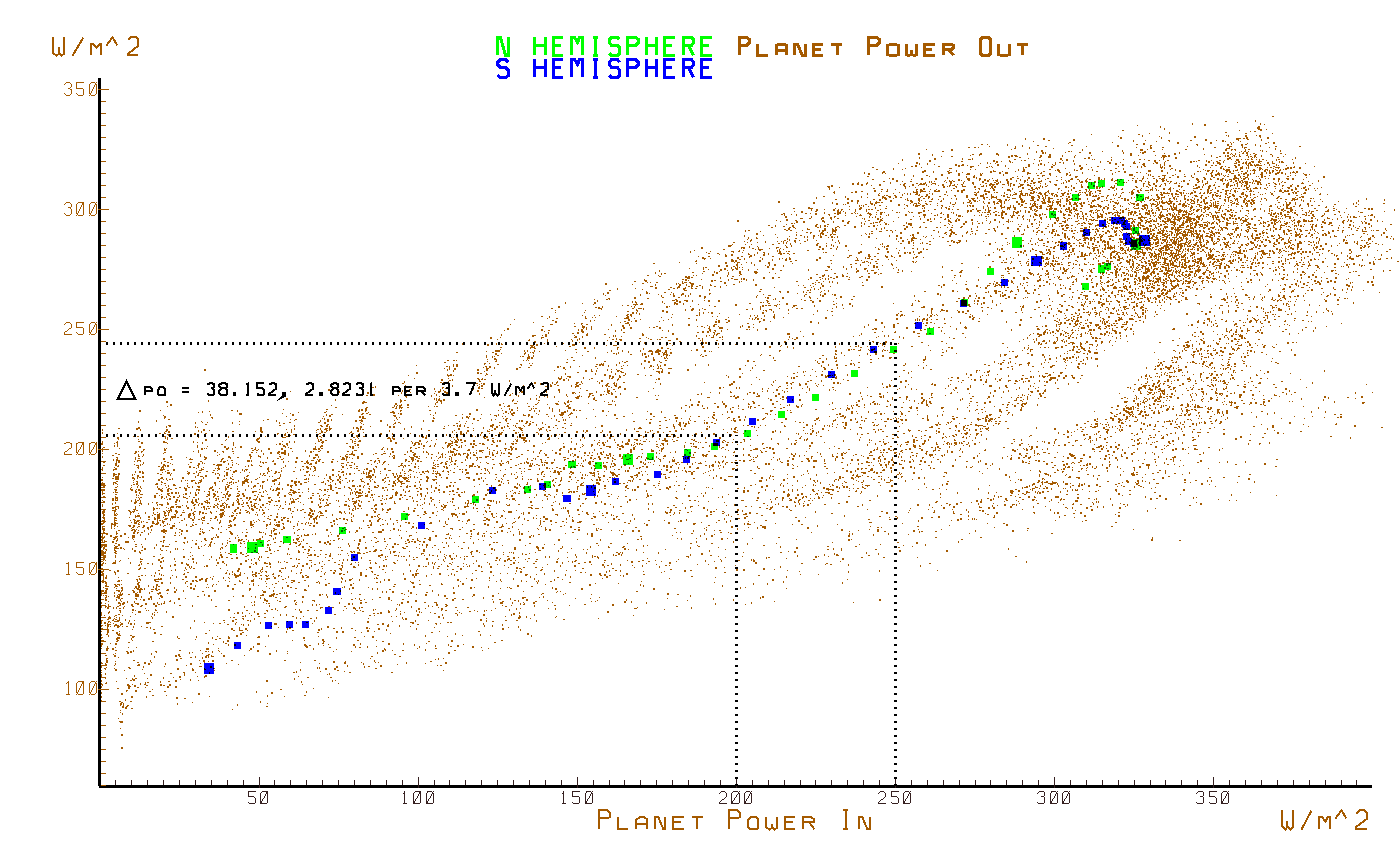
These plots demonstrate how linear the system response is regarding the relationship between an input power and an output power.
The sensitivities are measured in the center of the transfer function which corresponds to data extracted from the mid latitudes and which has a net zero yearly average transfer of energy from outside of the slice. There is a net loss of energy at the equator and net gains at the poles, all of which are evident in the data. The slope of the transfer functions in the mid latitudes of all of these plots demonstrates the linear nature of the response.
planet output power vs. surface emissions
cloud emissions vs. surface emissions
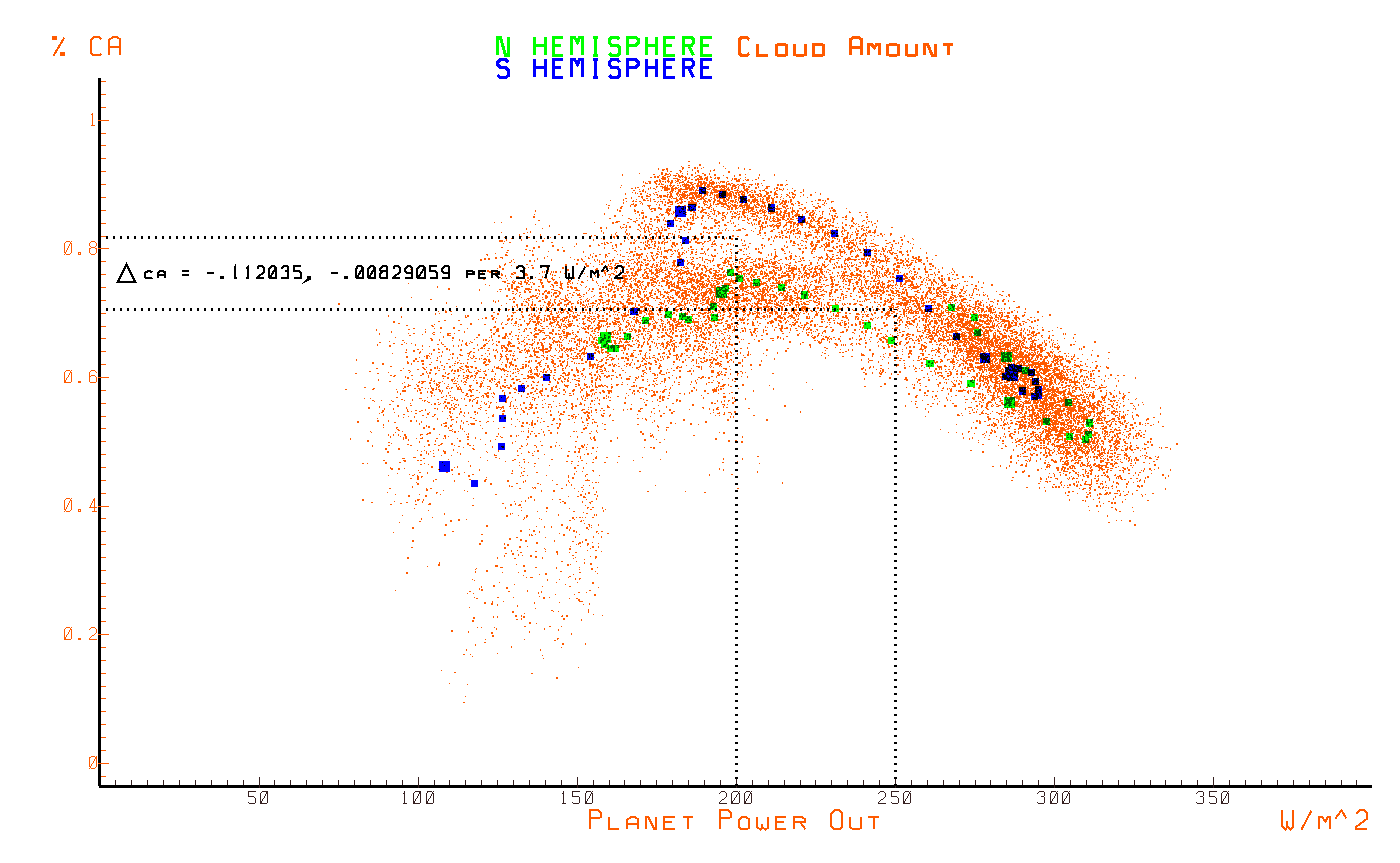
planet output power vs. planet input power
surface emissions vs. planet input power
planet input power vs. solar input power
surface emissions vs. solar input power
The small deviation of the monthly samples from the long term averages demonstrates a close causal connection between each pairs of variables.
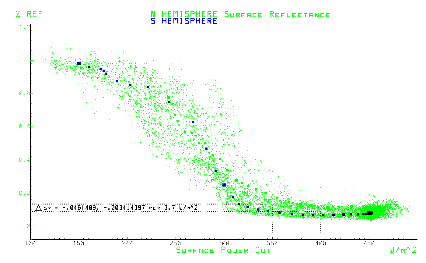
surface reflectivity vs. surface emissions
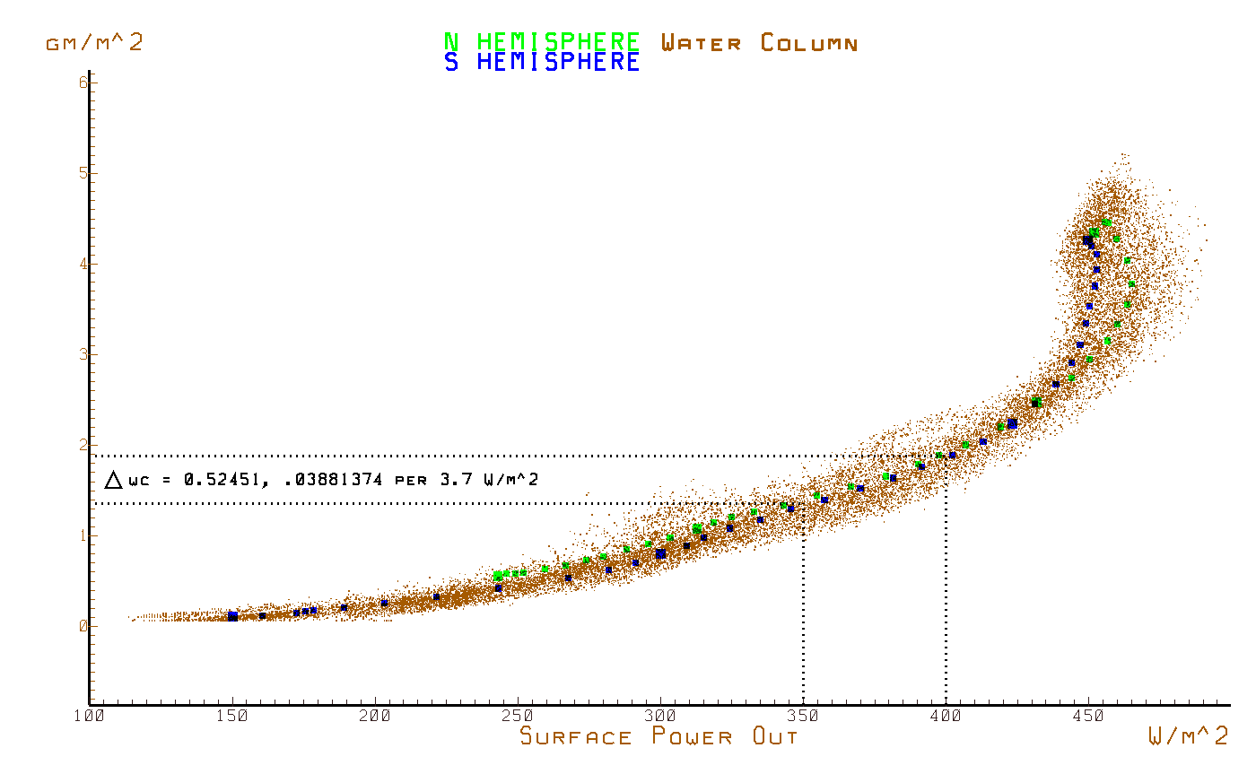
water content vs. surface emissions
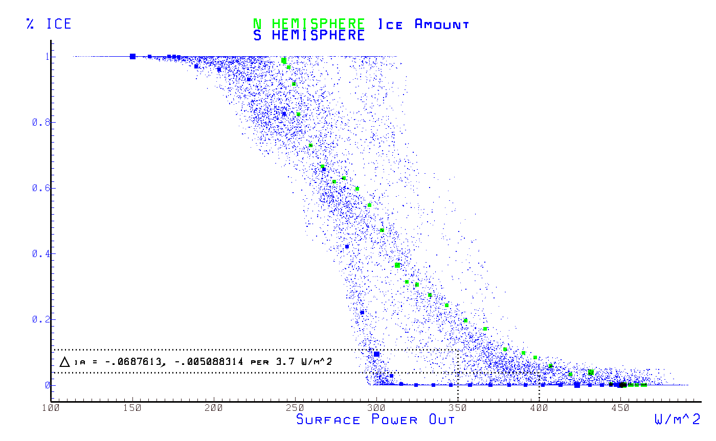
ice amount vs. surface emissions
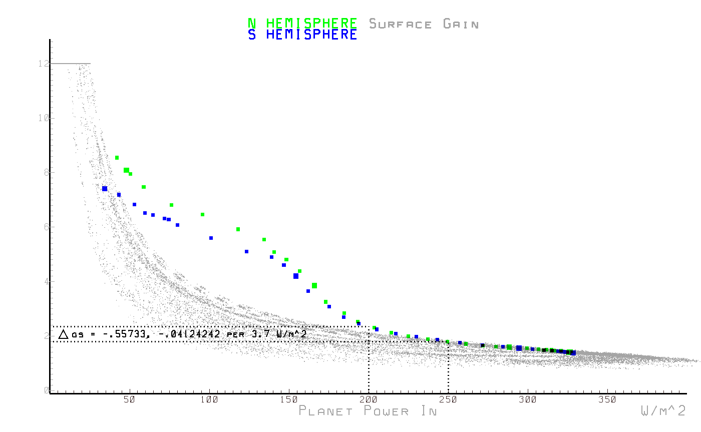
surface gain vs. planet input power
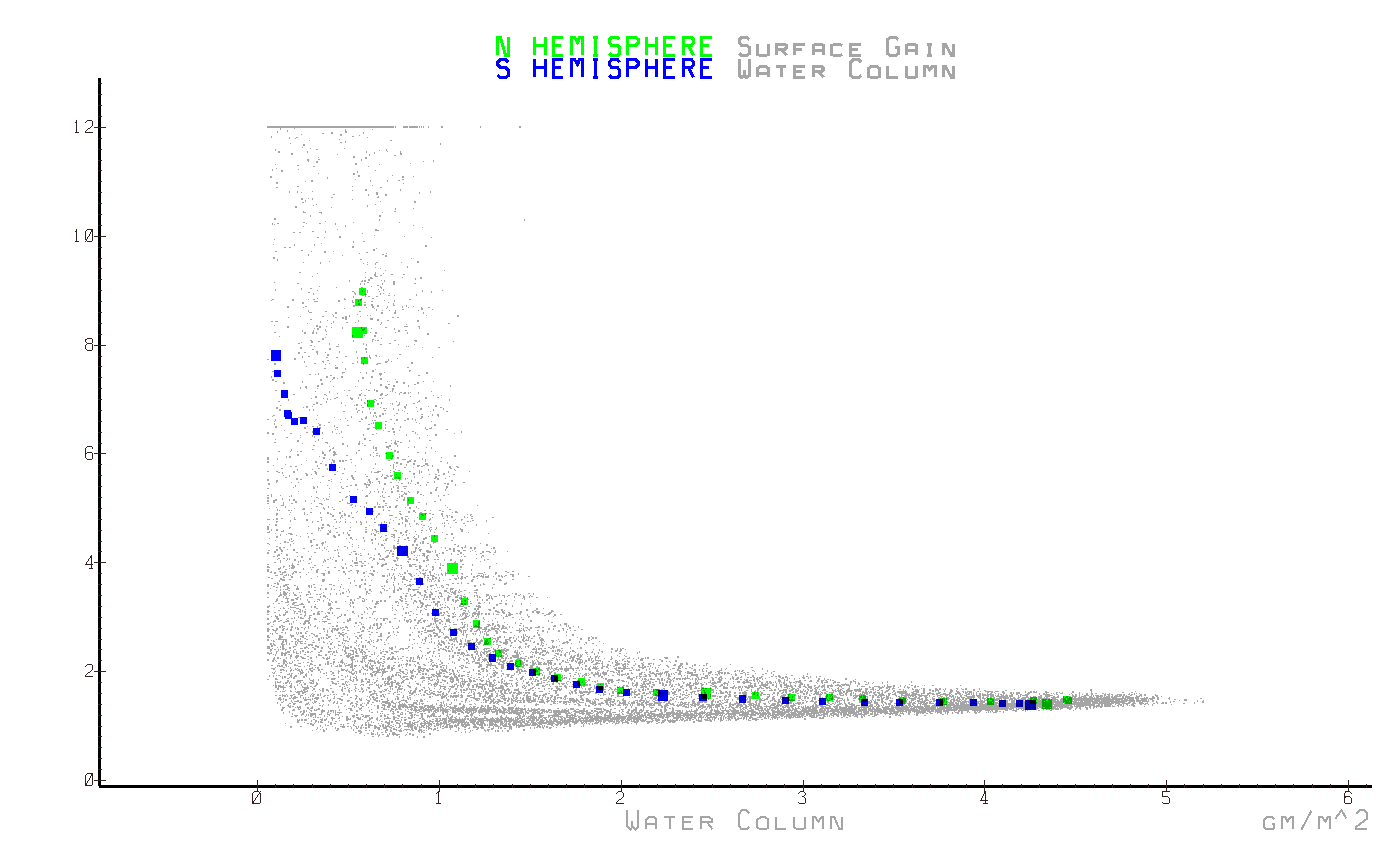
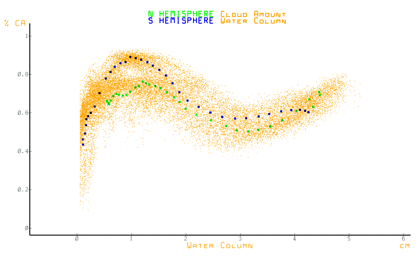
These are interesting because they show how clouds and water content are the control variables in the climate system which adapts to the requirements of a radiative steady state. Notice how the behavior of clouds adapts to changes in surface reflectivity as reflective ice and snow melts into dirt, rock and vegetation. Control is demonstrated by the highly non linear response of these variables to the various power fluxes as they adapt to the linear requirements of a power flux steady state. Another indication of control is when a cloud of sample points suggests an optimum value is being converged to.
cloud amount vs. surface emissions
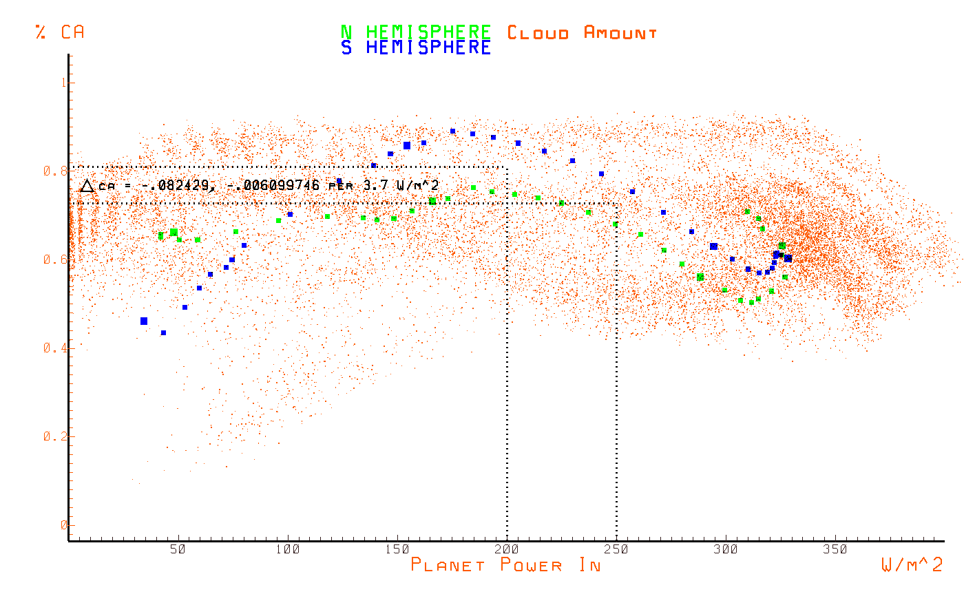
cloud amount vs. planet input power
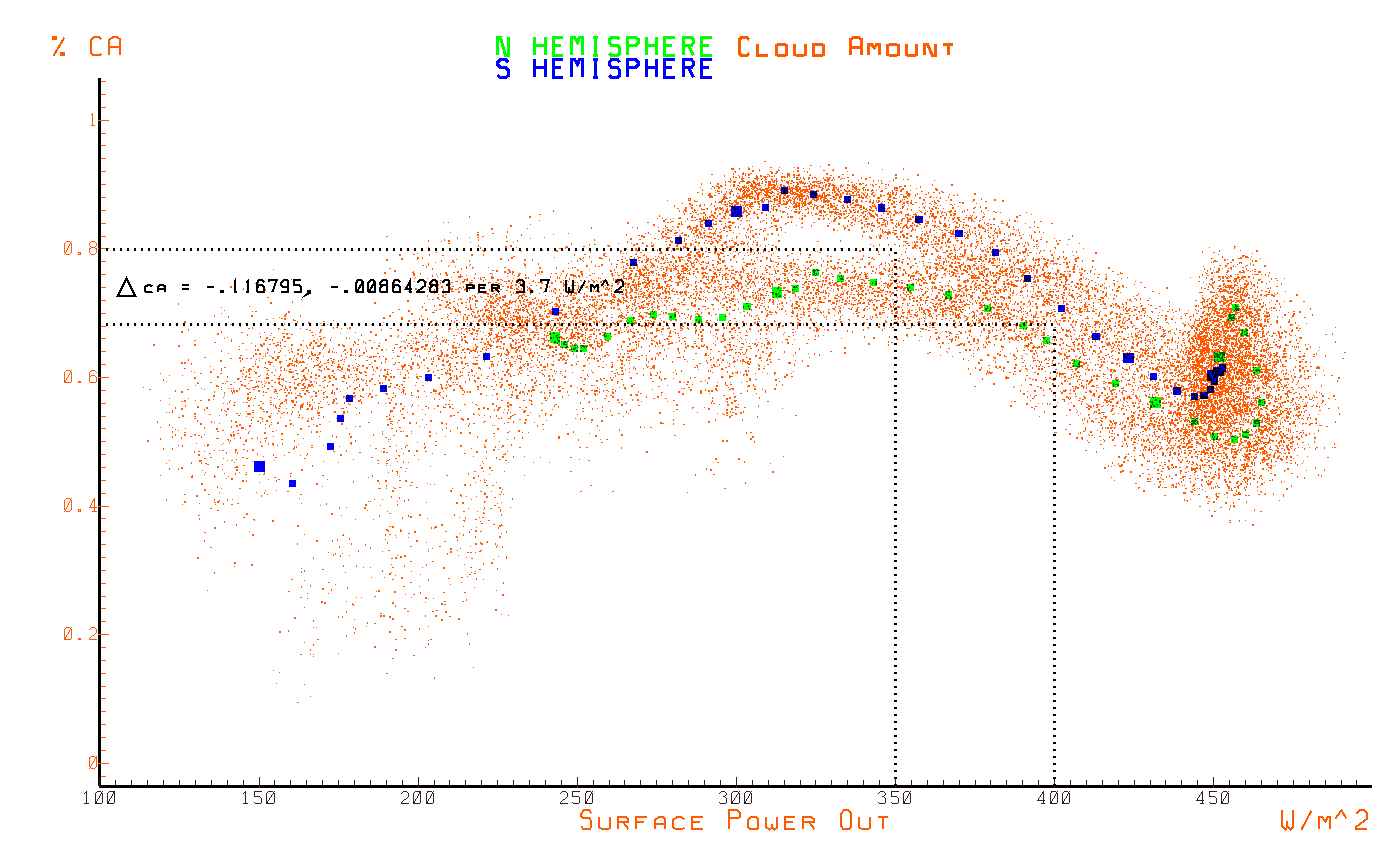
cloud amount vs. planet output power
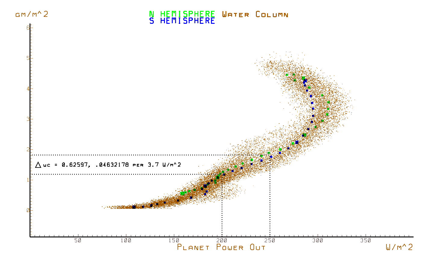
water content vs. planet output power
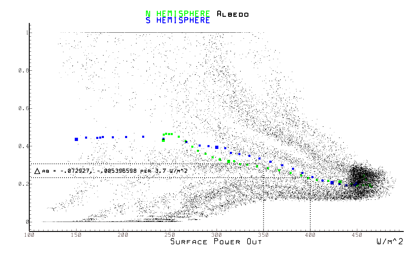
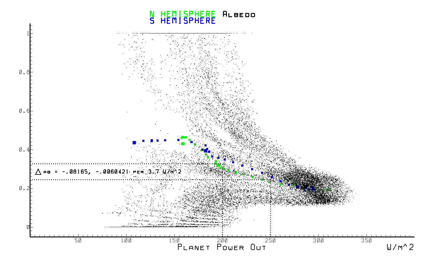
albedo vs. planet output power
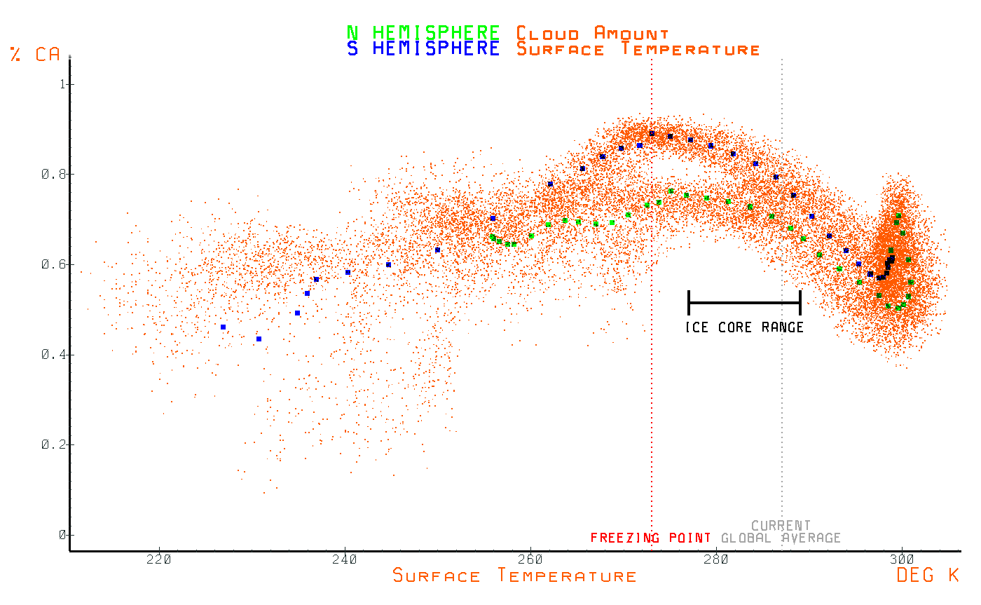
surface temperature vs. cloud amount
Three things should be apparent. First, the relationship between water content and surface emissions while non linear, is strictly monotonic and the same per hemisphere. Second, is that the relationship between the surface emission and cloud coverage is not monotonic, is very non linear and significantly different per hemisphere, while the ratio between the surface emissions and planet emissions is relatively constant from pole to pole indicating a strictly linear relationship between them. Given that the ratio between the surface emissions and the planet emissions is highly dependent on the amout of clouds, an interesting question arises.
Does a non linear relationship between atmospheric water vapor and the equivalent SB emissions corresponding to the temperature combined with a really bizarre, hemisphere specific, relationship between those emissions and the amount of clouds coincidentally result in an approximately linear relationship between the surface emissions and planet emissions from pole to pole, or is an appriximately linear relationship between the surface emissions and the planets emissions from pole to pole the goal of the system and the clouds adapt to this requirement?
If you accept Occam's Razor, then the correct answer should be obvious, especially since a radiant balance can be achieved for any amount of cloud coverage. The consequence is that climate science per the IPCC is so wrong, it's an embarrassment to all legitimate science and that the path we are on based on the faulty science coming from the IPCC is the real existential threat that we face.