Quantifying the Earth's energy balance is the first step towards understanding how the climate responds to change. When the Anthropogenic Global Warming (AGW) hypothesis first arose, there was no data both accurate enough and collected over a long enough period of time to test its predicted effects. Since then, weather satellites have continuously collected data as the rise in anthropogenic CO2 levels has accelerated. The 25+ years of accumulated satellite data, during which time CO2 levels have increased by more than 20%, is now suitable for testing the AGW hypothesis.
The first prediction of AGW to fail, is that a 20% increase in CO2 is expected to cause an increase in the average global temperature of about 0.8°C. Detecting trends in satellite data is difficult for many reasons. Year to year differences can exceed 1°C, global seasonal variability exceeds 3.5°C, hemispheric seasonal variability exceeds 12°C and discontinuities arise as the data from different satellites is merged, however; a 25 year trend this large should be evident and it's not. Because of the difficulty in detecting trends, few accept this failing test as a counter argument to AGW, and simply claim that the data is inconclusive. It's hard to argue that the absence of a predicted trend in the satellite record is conclusive, but the satellite data reveals a lot more than just temperatures.
The most revealing aspect demonstrated is seasonal variability. Climate analysis which emphasizes AGW, assumes that when seasonal variability is integrated across the Earth's surface and over a year, it averages out and thus can be ignored. This leads to the use of anomaly analysis, where monthly data is compared to independent long term monthly averages so that seasonal variability is removed from the results. The rationalization for doing this is that the expected trends are a tiny fraction of the monthly variability and they would be impossible to discern otherwise. See the section titled 'Anomalies and Absolute Temperatures' in this link for James Hansen's somewhat obtuse explanation. The side effect of this approach is that crucial behaviors of the climate system are obscured, leading to explanations for climate change that are consistent with the original flawed assumption and not the actual behavior. This is at the root of why so many are so mislead about what causes climate change.
The raw data used for this presentation came from the NASA GISS web site, which is the site with the web page justifying anomaly analysis. Rather than inferring trends from monthly satellite data, this analysis extracts the climate systems response from a 25 year average of the data. Once the response is known, the expected trend from varying a parameter, for example the CO2 concentration, can be accurately projected. More details about the data and the processing used can be found here. A description of the conventions used in the graphs can be found here. Throughout the presentation, clicking on any graph brings up a full size image.
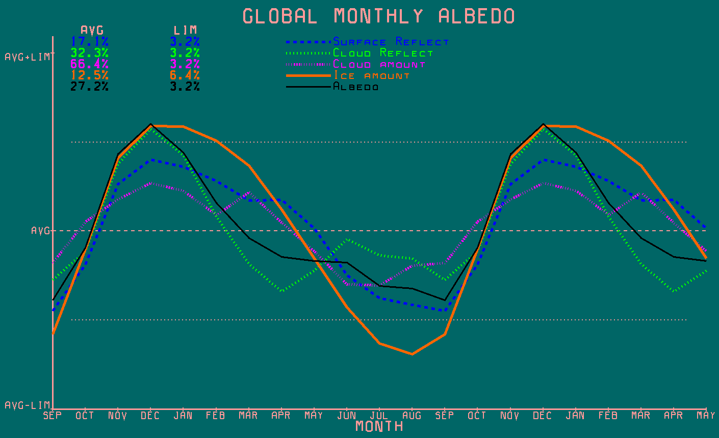
The first graph shows how the albedo and its constituent components vary during the year. The albedo is calculated as α = (1-ρ)*Rs + ρ*Rc, where Rs and Rc are the reflectivities of the surface and clouds and ρ is the fraction of the Earth covered in clouds, all of which are extracted from the satellite data.
The most important property to notice, is that the albedo is not constant. The albedo is greatest, that is, the Earth is most reflective, during the Northern hemisphere winter, when it's 10% more reflective than during summer. This manifests an apparent, negative feedback effect, relative to changing input energy and the response of the surface energy and temperature. This can be expected to continue for at least the next few thousand years. This arises because the maximum solar energy at perihelion coincides with when the Earth is most reflective, while minimum energy at aphelion coincides with minimum reflectivity. When this is reversed, as was the case about 11K years ago, and will be again in another 11K years, seasonal variability will be far larger than it is today.
Another important thing to notice is the sharp increase in albedo that occurs between October and November. This is the direct result of the accumulation of Northern hemisphere snow, whose effect is evident in many of the other variables. The surface reflectivity already includes the effects of ice and snow, but since observations from satellites show that the ice coverage varies widely, it's shown for reference purposes.
The consequence of a variable albedo, which is primarily topographically dependent, is that it can either amplify or attenuate the variability in the incident solar energy, as perihelion shifts through the seasons. This, and not anything related to greenhouse gas forcing, is the primary amplification effect seen in the ice core data.
The global energy flux is a quantification of the energy entering and leaving the Earth's thermal mass. The next graph shows how this varies during the year.
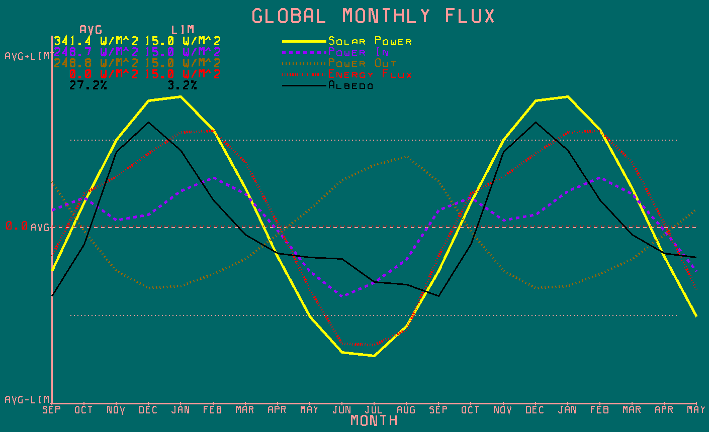
The input power is calculated as Pi = (1-α)*Psun, where Psun is the power from the Sun and α is the albedo, calculated above. This clearly shows that from October to November, while the incident solar energy is increasing, the input power is decreasing because the albedo, is increasing faster than the solar forcing power. The output power is calculated as Po = (1-ρ)*Ps + ρ*Pc + Pw, where ρ is the fraction of clouds, Ps and Pc are the power fluxes originating from the surface and clouds and Pw is the power consumed by the system and converted into work. Pw is a relatively small fraction of the total and is primarily the power consumed by weather and biology, which is otherwise not available to heat the planet. Surface and cloud power are represented as Plank distributions of power densities, as quantified by the reported cloud and surface temperatures. To calculate Po, these power distributions are filtered by the atmospheric absorption between the surface and space, or between cloud tops and space, weighted by cloud coverage, accumulated with surface power passing through clouds and power radiated by the atmosphere and then integrated over all wavelengths.
The top level equation describing the energy budget is, Pi = Po + Pe, where all variables are implicit functions of time and space. The variables Pi and Po are the power in and out of the system, as defined above, and Pe is the power flowing in and out of the Earth's thermal mass. This is a differential equation because Pe is more formally expressed as dE/dt, where E is the total amount of energy stored in the Earth's thermal mass and its derivative, dE/dt, is the rate of energy entering or leaving this thermal mass, moreover; Po, being dependent on the surface and cloud temperatures, is also dependent on E. Conservation of energy dictates that this relationship must be exactly true at all times. If Pi is not equal to Po, the difference must either be stored in the system or released by the system, depending on the sign of the difference. When Pe is positive, the Earth is gaining energy and warming and when it's negative, the Earth is loosing energy and cooling.
The global energy flux, Pe, is the difference between 2 measured values, Pi and Po, and has an average value near zero. The most important thing to notice, is that the Earth is always in a state of energy imbalance, except for a time in early April and again in mid September. During half of the year, energy is being stored in the Earth's thermal mass and during the other half, the Earth's thermal mass is releasing energy. The peak to peak value of this global energy flux, is about 10 W/m² around it's average value of zero. When this analysis is performed on a single year, rather than on the average of 25 years, the average value is either a small positive, or small negative number, depending on whether the Earth is warming or cooling from year to year.
The next step is to examine how this measured energy flux is related to surface and cloud temperatures. The next graphs illustrate these relationships as global averages and as hemispheric specific averages.
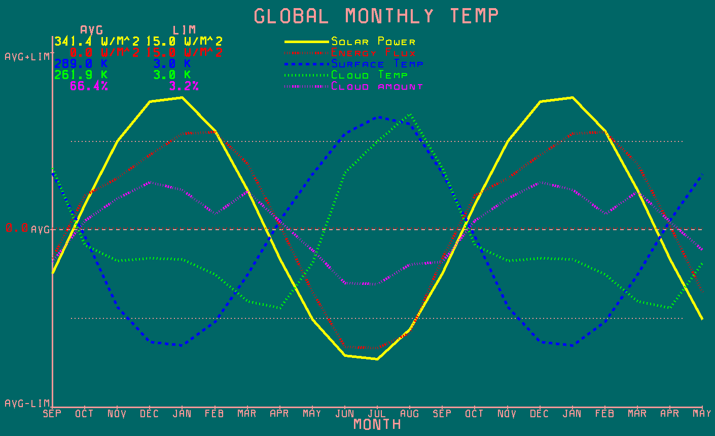
Each graph shows the solar energy and energy flux, as described earlier, and the surface temperature and cloud temperature, which are also measured by satellites. As expected, the net flux in and out of the Earth's thermal mass, Pe, closely follows the solar input variability. What may not be expected is that the global average temperatures are about 7 months, or 210° out of phase with the net flux in and out of the Earth's thermal mass. Understanding why this is the case requires examining the individual hemispheric responses.
The hemispheric specific Pe and temperature plots again show that Pe closely tracks the incident energy. Unlike the global case, the hemispheric average temperatures lag Pe by about 60°, or 2 months. This corresponds to the observed 2 month delay between the minimum or maximum solar energy and the minimum or maximum temperatures and is indicative of the climate systems time constant. The 2 hemispheres are out of phase with each other and the sum of the 2 quantifies the global response. The Southern hemisphere Pe is larger than that in the North, while the Northern hemispheres temperature variability is larger than that in the South. In addition, there are subtle phase difference due to the slightly different time constants between hemispheres. This explains the relationship seen in the global averages and is just one of the many reasons why hemispheric asymmetry and seasonal variability can't be ignored. You may notice that the algebraic sum of the hemispheric temperatures doesn't match the global temperature. This is a result of different means between hemispheres and that energy, not temperature, is summed algebraicly.
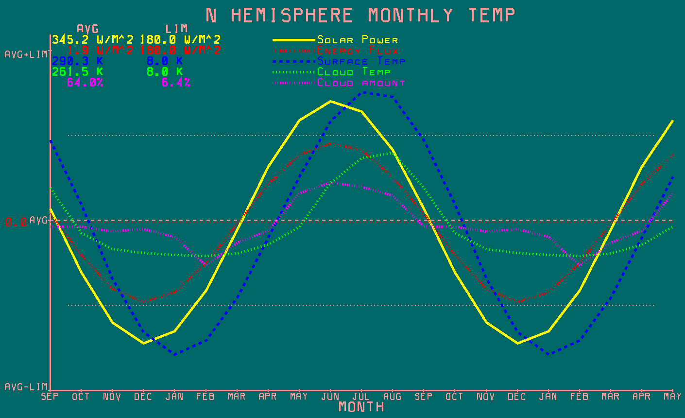
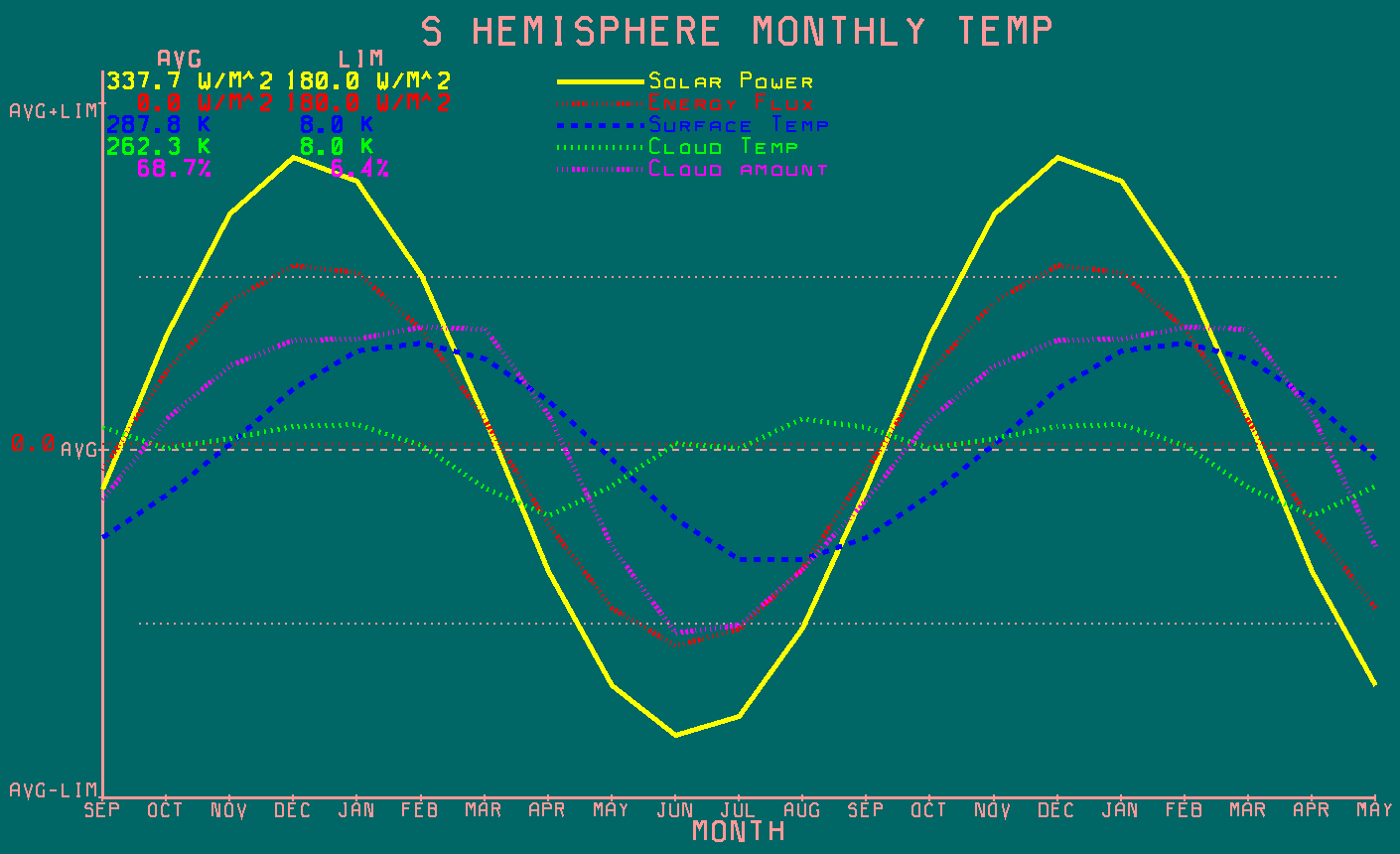
The most important thing that these graphs show, is that the Earth responds rapidly to changes in forcing. This contradicts claims that the Earth takes decades to respond to forcing changes. A slow response is necessary to support the common prediction of AGW that there's pent up warming that hasn't occurred yet, but will later. This claim is often used to counter the observations of skeptics who point out that predicted temperature increases are notably absent. This test shows the claim of a slow response to be incorrect, at least relative to seasonal variability in radiative forcing and there's no reason to believe that the climate will not respond just as quickly to smaller and/or slower changes in radiative forcing.
Another important result is that while the peak to peak global flux is about 20 W/m², the peak to peak flux in each hemisphere is nearly 200 W/m². This represents a massive exchange of energy between the Earth and its environment and is 50 times larger than the forcing flux from doubling CO2 levels, moreover; the forcing flux from doubling CO2 occurs slowly over centuries, while the large flux in and out of the system happens every year. When the rate of change is considered, GHG forcing flux related to CO2 occurs at a rate 10000 times smaller than seasonal flux changes.
A common explanation for why hemispheric asymmetry doesn't matter is that an energy flux flows between hemispheres to equalize the system. This is contradicted by examining ocean circulation currents and weather circulation patterns. The hemispheric specific flows in the oceans and atmosphere run parallel to each other at the equator. The satellite data show very little seasonal temperature variability across a 30° slice of latitude centered on the equator. This is important because an energy flux must be accompanied by a proportional temperature differential. Thermodynamics tells us that energy flows from warm bodies to cold bodies. The warmest part of the Earth is the equator, which means that energy flows from the equator to the poles, but not across the equator, except due to some tropical weather systems and some minor coupling where Northern and Southern ocean currents run parallel to equatorial currents. This weak coupling is often considered part of the Thermohaline circulation. The result is that the 2 hemispheres are only weakly thermodynamically coupled and respond to change mostly independent of each other.
Another indication of the independent hemispheric response is the nearly linear sinusoidal relationship between the output variables, energy flux and surface temperature, and the sinusoidal incident solar energy. This would not be the case if there was a substantial energy flux flowing between hemispheres, where each hemisphere's response would exhibit some signature of the other and be equal in magnitude.
The next thing the data reveals is the size of the thermal mass that must be moved, in order to affect a change in the Earth's temperature. From the satellite data, the Northern hemisphere's temperature varies by about 12.5°C, while the Southern hemisphere's temperature varies by about 5°C. If only ocean surface temperatures are considered, the temperature of the Southern hemisphere also varies by about 5°C, while the temperature of the Northern hemisphere varies by 5.3°C.
The Southern hemisphere average temperature almost exactly tracks the Southern hemisphere ocean temperature, making it a good starting point for the analysis. The Southern hemisphere energy flux is about 200 W/m² peak to peak. Simulations show that the six months peaking at 100 W/m² adds about 1 GJ of energy to the system, while the six months peaking at -100 W/m² removes about 1 GJ. The data shows that the Southern hemisphere experiences about 5°C of warming and 5°C of cooling per year. If we consider the thermal mass to be only water, 1 GJ can raise the temperature of about 47.7 million grams of water by 5°C (based on 4.19 Joules/calorie). A cubic meter of water weighs 1 million grams and the Southern hemisphere is 82% water, so the depth of water that must be heated or cooled to affect a temperature change of 5°C is about 58.2 meters.
The inflection points in the oceans temperature profile clearly indicate that the thermocline is a layer of insulation separating deep cold waters from warm surface waters. The water above the thermocline is that where the surface temperature is greater or equal to the temperature of the inflection point between the thermocline and warm surface waters, which is about 22°C (295°K). This represents the half of all surface waters centered around the equator. At the equator, the surface layer is about 250m deep and conceptually, tapers off to 0 meters where the ocean surface temperatures are 22°C. The equivalent depth of this much water covering a single hemisphere is about 62.5 meters. Both calculations are relatively rough and subject to about ±15% error. A reasonable range would be 60 meters ±8 meters, and both calculations fall well within these limits.
The Northern hemisphere gains and then loses about 0.82 GJ/year. The ocean temperature change is larger, at 5.3°C. The same calculation, adjusted for 62% water, gives a depth of 59.6 meters, which also falls in the middle of the expected range.
The slow response times often claimed to support AGW arguments assume that the entire mass of the ocean must warm or cool before a temperature change fully manifests itself. The function of the thermocline as an insulating layer, which is confirmed by satellite measurements, clearly shows that a smaller volume of water is involved and that the oceans respond very quickly to change. This is the second test which invalidates this specific prediction of the AGW hypothesis.
The most important result from the data is a precise quantification of the sensitivity of the climate to changes in forcing power. This can be calculated as the ratio between the outgoing surface energy and the albedo adjusted incident solar energy. The information required to calculate this is available across a very wide range of conditions, so it's possible to characterize how the sensitivity changes in response to changes in other parameters. Examining how the sensitivity varies will also reveal whether the net feedback operating on the system is positive or negative. Using the ratio between surface and incident energy is superior to any other metric for measuring the climate sensitivity to the seasonal changes in radiative forcing. This accounts for all feedbacks, positive or negative, known and unknown and removes all of the assumptions about feedback that usually go into such calculations. The next graph shows the sensitivity, or gain, of the global climate system.
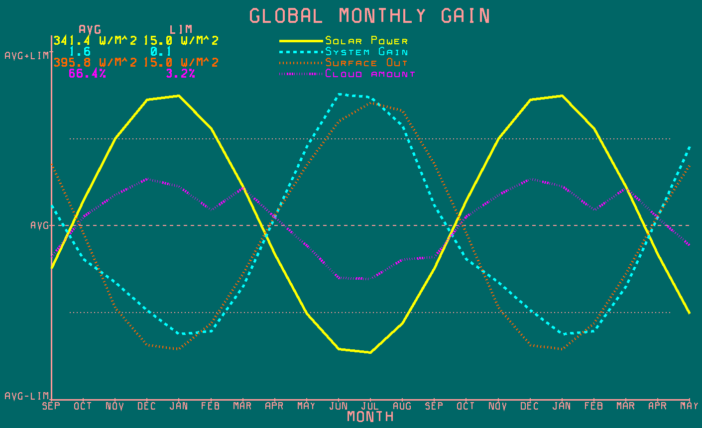
In this graph, the gain is the ratio between the surface power and the albedo adjusted input power. The surface power is the Plank distribution of surface energy, derived from satellite temperature measurement. No atmospheric filtering is applied and the energy distribution is independent of cloud coverage. The solar forcing is also shown for reference purposes. The resulting gain has an average value of 1.6 varying between about 1.525 and 1.675. This means that 1 watt of surface forcing will result in about 1.6 watts of post feedback, steady state, surface power when integrated over a year. According to HITRAN based simulations, the atmosphere captures 3.6 W/m² of additional power when the CO2 is increased from 280ppm to 560ppm. Of this, the atmosphere radiates half of this up and half down. When the 1.8 W/m² of forcing power directed down is treated the same as 1.8 W/m² of additional solar forcing, the systems response is to increase the surface power by 2.88 W/m². From the Stefan-Boltzmann Law, the starting temperature of 288K corresponds to a surface energy of 390.1 W/m². If the surface power increases by 2.88 W/m², the corresponding temperature increase is only 0.55°C and not the 3°C predicted by the AGW hypothesis.
The 2007 IPCC Fourth Assessment Report (AR4) says the equilibrium value for temperature increase from doubling of atmospheric CO2 concentration is "likely to be in the range 2 to 4.5°C with a best estimate of about 3°C, and is very unlikely to be less than 1.5°C.". The estimates of climate sensitivity reported by the IPCC are derived from model estimates. The 0.55°C temperature increase from doubling atmospheric CO2 concentrations reported here, is obtained from empirical observations of the climate systems response to change.
The same analysis can be performed in reverse to show how unlikely a 3°C rise is, given the same forcing power. In order to increase the surface temperature by 3°C, an additional 16.6 W/m² of surface power is required. This requires a gain in excess of 9 in order to amplify 1.8 W/m² of GHG forcing directed to the surface into enough power to cause 3°C of warming. This much gain is simply not possible from the climate system based on its measured response to changes in radiative forcing.
The next two graphs show the gain calculations specific to each hemisphere.
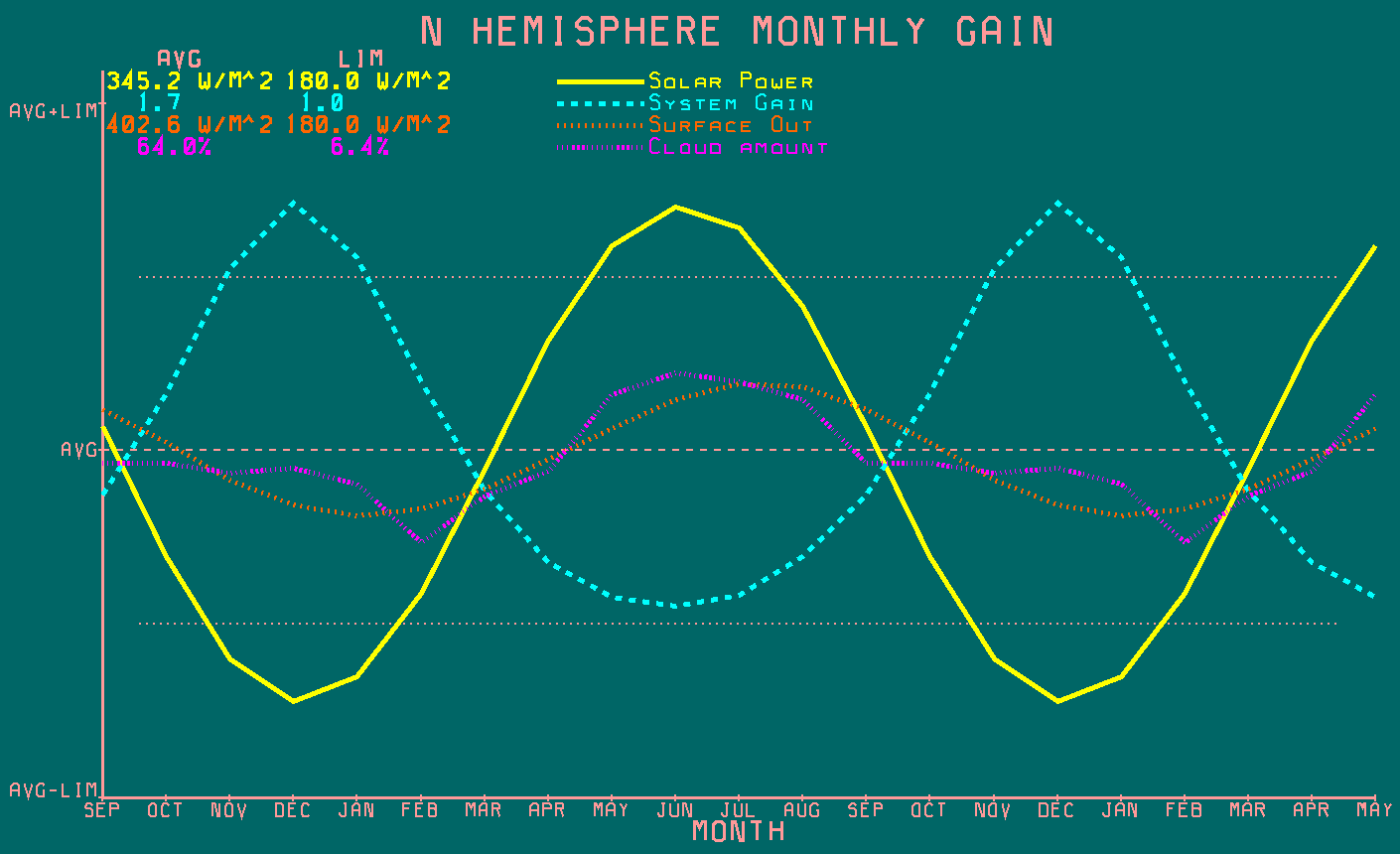
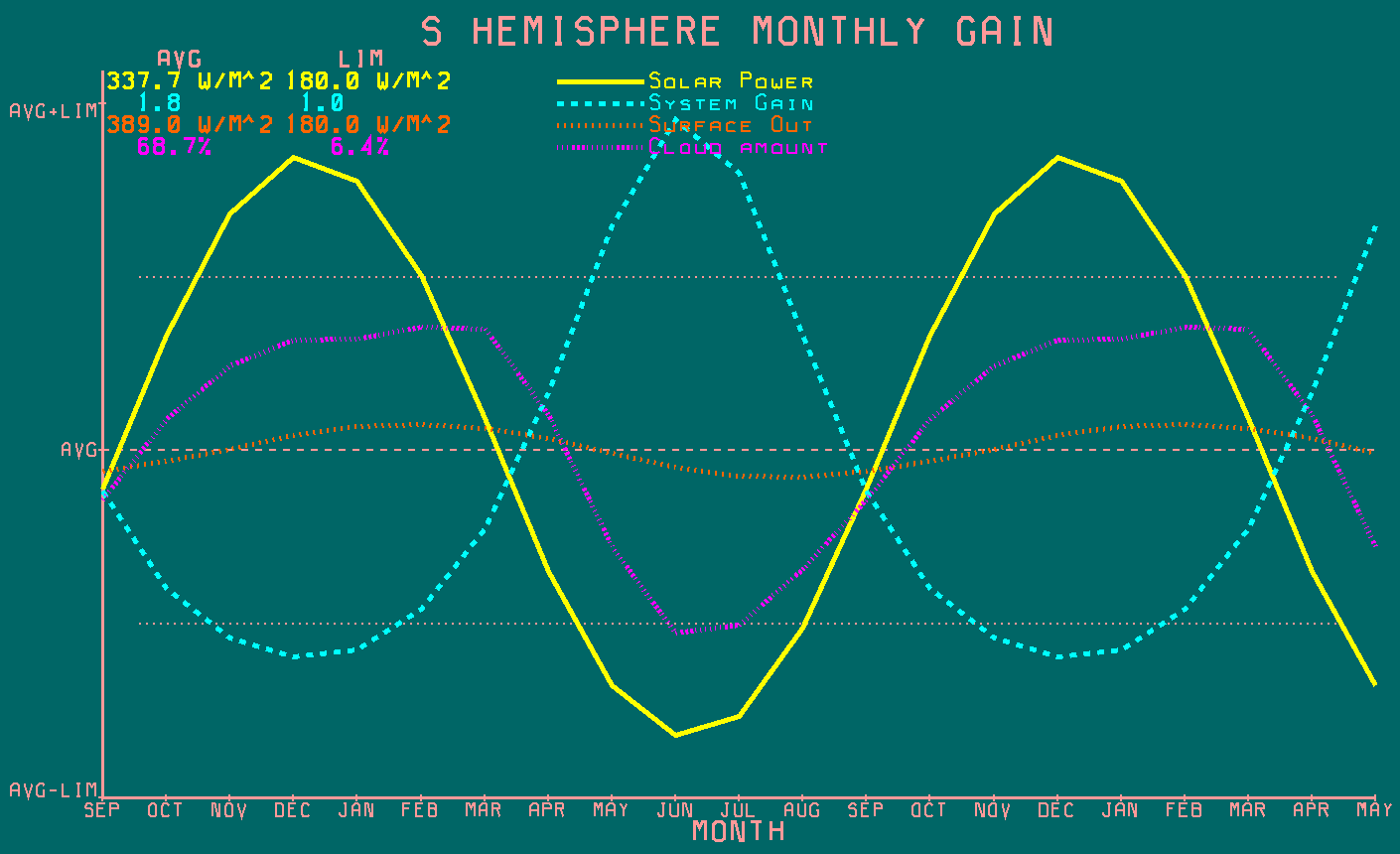
Each hemisphere shows significantly more gain variability than is evident in the global response. The Southern hemisphere shows the most, with a gain between 1.15 and 2.7, but even the maximum instantaneous gain is far too small than the consensus climate sensitivity requires. Despite the larger variability, the average gain of each hemisphere is relatively close to that of the planet as a whole. This indicates that the average climate sensitivity is relatively uninfluenced by significant hemispheric differences.
The gain plots also show an important relationship between energy and cloud cover. As the energy and temperature increases, the cloud coverage increases. Similarly, as the energy and temperature decreases, cloud coverages decreases. The cloud coverage lags the input power and is more or less coincident with surface power. This is a strong indication that cloud coverage is a controlling variable of the climate system.
The results from both hemispheres share a very important characteristic, which is that as the radiative forcing increases, the gain decreases, and visa versa. This is clear from the plots, where the gain is out of phase with the input energy. In addition, the proportional gain change is larger at lower energies than it is at higher energies. This illustrates negative feedback in response to changing energy and surface temperatures. Negative feedback is defined as feedback that opposes change. If the gain is increasing as the temperature is decreasing, the increased gain will boost surface temperatures, keeping them from decreasing. Positive feedback is defined as feedback that reinforces change. If the net feedback was positive, the gain would increase as temperatures increased, pushing temperatures higher. The cloud coverage combined with cloud top temperatures, both driven by water vapor concentrations, seems to be modulating the gain in order to control the climate in a manner consistent with a system exhibiting strong net negative feedback. The underlying basis of the current AGW hypothesis is that a small amount of additional forcing from increased anthropogenic CO2 is amplified by a climate system dominated by strong net positive feedback from water vapor. The data confirms that increasing temperatures increase water vapor but contradicts the AGW hypothesis and supports a system that exhibits strong net negative feedback in response to changing radiative forcing.
The analysis of the satellite data shows conclusively that every prediction of the AGW hypothesis that can be tested by quantifying the energy balance fails. It only takes one failed test to disprove a hypothesis, and here we have many. The only possible conclusion is that the climate forcing effects of anthropogenic CO2 are far smaller than the AGW communities consensus value. In fact, it's so small, that it's certain that the trillions of dollars we are poised to spend on CO2 mitigation will have no effect, other than to drag down the worlds economy and impede the goal of energy independence.
Equally important is that the analysis shows why the AGW community is so wrong about the climate sensitivity and yet still believes its estimates are correct. The reason is that the anomaly analysis used to present results hides crucial aspects about how the climate system responds to change. This leads to incorrect explanations for how climate change occurs based on incomplete information.